slide1

Alt1040. Noticias acerca de Internet, diseño, música, cine, opiniones, weblogs y medios

Es uno de los weblogs de tecnología más seguidos de la blogosfera hispana.

slide2

Bitelia. Blog de software, internet y servicios web

Software y aplicaciones para mejorar tu vida, guías de uso, trucos, listas, noticias y todo sobre tecnología.

slide3

Xataka. Publicación de noticias sobre gadgets y tecnología.

Últimas tecnologías en electrónica de consumo y novedades tecnológicas en móviles, tablets, informática, etc.

slide4

Wwwhatsnew. Aplicaciones, marketing y noticias en la web.

Servicios que os pueden ser útiles para dibujar, gestionar tareas, hacer amigos, encontrar restaurantes...

slide5

Fayerwayer. Discusiones y opiniones de lo ultimo en tecnología y gadgets

Con secciones dedicadas a Internet, Software o Redes Sociales es un referente a nivel de tecnología en español.

11 de diciembre de 2021

Introducción a la automatización robótica de procesos (RPA)

Robotic Process Automation
Con un número creciente de empresas que tratan de optimizar sus estrategias de transformación digital, se ha producido un aumento en la adopción del sistema RPA (Robotic Process Automation) para automatizar los procesos administrativos. Esto ha llevado a un crecimiento exponencial en el mercado global de RPA que ya estaba valorado en $1.4B en 2019 y se espera que alcance los $11B en 2027.


La pandemia de COVID-19 ha llevado a muchas empresas a adoptar tecnologías de computación en la nube y trabajo remoto. Además, los equipos de TI se han visto presionados para reducir la carga de trabajo y los costos operativos.

Una encuesta reciente reveló que las empresas están aumentando el uso de RPA aproximadamente un 5% para:

- reducir los costos extraordinarios al automatizar las tareas operativas y de back office, como los procesos de TI basados en reglas, las actualizaciones del sistema o la incorporación de nuevas contrataciones.

- apoyar a la fuerza de trabajo remota, por ejemplo, automatizando la recopilación de datos de múltiples fuentes para la generación de informes.


RPA


¿Qué es la automatización robótica de procesos?


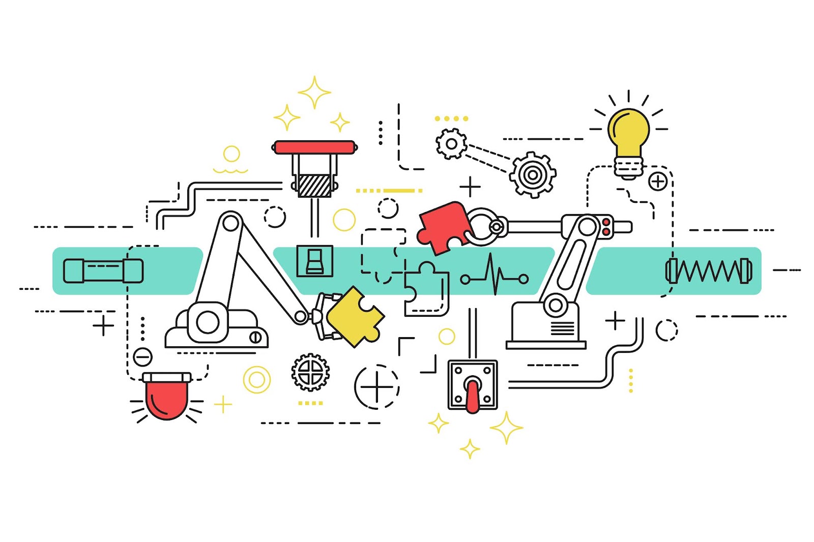
Es una tecnología que imita e integra las interacciones de los usuarios humanos con las aplicaciones o sistemas informáticos, automatizando los procesos de trabajo de la misma manera que lo haría un usuario.

Estos robots son entrenados para seguir unas instrucciones específicas y ejecutar ciertas tareas, tareas como por ejemplo cuando un usuario tiene que acceder a un correo electrónico o a un directorio compartido y extraer 'x' ficheros para realizar ciertas modificaciones o verificaciones dentro de estos ficheros.

Una vez finalizadas estas tareas, tiene que compartir estos ficheros a través de una plataforma web o un repositorio común.
El robot podría hacer estas mismas tareas del mismo modo que las gestiona un usuario humano.

¿Qué ventajas tiene el uso de RPA?


Son numerosas las ventajas del rpa, destacando la agilidad operacional puesto que un robot es cinco veces más rápido que una persona.

Son herramientas que monitorizan la ejecución completa del robot, por lo tanto desde el punto de vista de auditoría, son herramientas bastante seguras.

Se trata de herramientas no invasivas ya que interactúan con la interfaz permitiendo atacar a la mayoría de las aplicaciones.

Tambien son herramientas muy escalables, muy precisas y que trabajan de forma continua (24x7 los 365 días del año) por lo que van a estar siempre disponibles.

Por otro lado permiten que las personas se enfoquen en el talento ya que el objetivo es aportar valor en las empresas y no realizar tareas repetitivas que no generen ningún tipo de valor añadido.

Además, son herramientas con un ROI muy elevado ya que existe una rápida recuperación de la inversión con perídos de payback inferiores a un año.

¿Qué tipos de procesos son candidatos a ser robotizados o automatizados?


Siempre se busca un patrón con una serie de características como por ejemplo que los procesos sean estándar, es decir, que no tengan ambiguedad y que estén procedimentados.

También es necesario que estos procesos estén basados en reglas ya que tenemos que entrenar al robot y decirle cuales son los pasos que tienen que seguir para ejecutar estas tareas.

Tienen que ser procesos con datos electrónicos cuyo formato siempre sea digital. Procesos en los que el tiempo de ejecución sea mejorable, procesos repetitivos, procesos desarrollados en sistemas estables y procesos que ya sean maduros, estén en funcionamiento y bien definidos.

En RR.HH. podrían ocuparse de:

  • verificación del historial del empleado
  • gestión de viajes y gastos
  • gestión de asistencia
  • gestión de nóminas
  • gestionar los datos de los empleados
  • añadir datos para revisiones de desempeño
  • gestionar la baja de los empleados

En el departamento financiero:

  • automatización de nóminas
  • preparar informes financieros
  • mantenimiento de registros

En el departamento de TI:

  • descargar software con licencia
  • instalar y actualizar software disponible en servidores preasignados y máquinas de usuarios
  • monitorizar y guardar datos de rendimiento de un servidor
  • automatizar notificaciones de problemas en un servidor o tiempos de inactividad
  • automatizar copias de seguridad
  • sincronizar, eliminar y vaciar carpetas


7 de diciembre de 2021

Cuenta atrás para la Navidad

Christmas Icon
TecnoBlog les desea a todos sus lectores Feliz Navidad con esta animación realizada con jQuery. Si lo deseas, puedes descargar y modificar el ejemplo para añadirlo a tu página web siguiendo las instrucciones detalladas más abajo.
(Fuente: https://codepen.io/JorgeAguilar/).


Para componer la animación, tendrás que incorporar código html, adaptar los estilos correspondientes importando la fuente de Google Mountains of Christmas con tres imágenes de fondo y código javascript con la librería jQuery.

Código HTML
<section class="countdownSection">
  <div class="decorations">
    <div class="decoration" data-pos="bottom left"></div>
    <div class="decoration" data-pos="top right"></div>
    <div class="snow"></div>
    <div class="santaWrapper">
      <div class="santa">
        <div class="hat">
          <div></div>
          <div></div>
        </div>
        <div class="face">
          <div class="eyeBrows left"></div>
          <div class="eyeBrows right"></div>
          <div class="eye left"></div>
          <div class="eye right"></div>
          <div class="nose"></div>
          <div class="cheek left"></div>
          <div class="cheek right"></div>
          <div class="beard">
            <div></div>
            <div></div>
            <div></div>
          </div>
        </div>
        <div class="body">
          <div class="sweater"></div>
          <div class="hand left">
            <div class="inner"></div>
          </div>
          <div class="hand right"></div>
        </div>
      </div>
      <div class="rope"></div>
      <div class="rope back"></div>
      <div class="sled"></div>
      <div class="reindeer">
        <div class="face">
          <div class="ear"></div>
          <div class="horn right"></div>
          <div class="horn left"></div>
        </div>
        <div class="body">
          <div class="foot front">
            <div class="inner">
              <div class="extension"></div>
            </div>
          </div>
          <div class="foot back">
            <div class="inner">
              <div class="extension"></div>
            </div>
          </div>
          <div class="tail"></div>
        </div>
      </div>
      <div class="reindeer second">
        <div class="rope"></div>
        <div class="face">
          <div class="ear"></div>
          <div class="horn right"></div>
          <div class="horn left"></div>
        </div>
        <div class="body">
          <div class="foot front">
            <div class="inner">
              <div class="extension"></div>
            </div>
          </div>
          <div class="foot back">
            <div class="inner">
              <div class="extension"></div>
            </div>
          </div>
          <div class="tail"></div>
        </div>
      </div>
    </div>
  </div>
  <div class="container">
    <div class="counterWrapper">
      <p>Sólo quedan ...</p>
      <div class="countdown"></div>
      <p>para Navidad</p>
    </div>
  </div>
</section>

Código CSS
<style>
@import url("https://fonts.googleapis.com/css2?family=Mountains+of+Christmas:wght@700&display=swap");
@keyframes santa__mov {
  0%, 100% {
    bottom: 0;
    left: 0;
    transform: translateX(-100%) rotate(-10deg);
  }
  30% {
    bottom: 100%;
    left: 100%;
    transform: translateX(100%) rotate(-10deg);
  }
  40% {
    bottom: 0;
    left: 100%;
    transform: translateX(100%) rotateY(180deg);
  }
  70% {
    bottom: 0;
    left: 0;
    transform: translateX(-100%) rotateY(180deg);
  }
}
@keyframes santa__hand-left {
  0% {
    transform: rotate(15deg);
  }
  100% {
    transform: rotate(-30deg);
  }
}
@keyframes santa__hand-right {
  0% {
    transform: rotate(15deg);
  }
  100% {
    transform: rotate(-6deg);
  }
}
@keyframes rope__left {
  0% {
    transform: rotate(2deg);
  }
  100% {
    transform: rotate(5deg);
  }
}
@keyframes rope__right {
  0% {
    transform: rotate(0deg);
  }
  100% {
    transform: rotate(-4deg);
  }
}
@keyframes rope__inner {
  0% {
    transform: rotate(-15deg);
  }
  100% {
    transform: rotate(-15deg) translateY(3px);
  }
}
@keyframes reindeer__leg-front {
  0% {
    transform: rotate(-24deg);
  }
  100% {
    transform: rotate(-13deg);
  }
}
@keyframes reindeer__leg-front-extension {
  0% {
    transform: rotate(131deg);
  }
  100% {
    transform: rotate(0);
  }
}
@keyframes reindeer__leg-back {
  0% {
    transform: rotate(-73deg);
  }
  100% {
    transform: rotate(-95deg);
  }
}
@keyframes reindeer__leg-back-extension {
  0% {
    top: 4px;
    left: -4px;
    transform: rotate(50deg);
  }
  100% {
    top: 0;
    left: 0;
    transform: rotate(0);
  }
}
@keyframes snow {
  0% {
    fill-opacity: 1;
  }
  100% {
    fill-opacity: 0;
    transform: translateY(50%);
  }
}
body {
  overflow-x: hidden;
  color: #fff;
  margin: 0 auto;
  background-color: #005b38;
}
body * {
  font-family: "Mountains of Christmas", cursive;
}
body p, body h1, body h2, body h3, body h4, body h5, body h6 {
  margin: 0;
}
body a {
  color: #fff;
  text-decoration: none;
}
body ul, body li {
  padding: 0;
  margin: 0;
  list-style-type: none;
}
.countdownSection {
  display: flex;
  flex-direction: row;
  flex-wrap: wrap;
  align-items: center;
  justify-content: center;
  align-content: center;
  width: 100%;
  min-height: 100vh;
  box-sizing: border-box;
  position: relative;
  overflow: hidden;
}
.countdownSection:before, .countdownSection:after {
  content: "";
  position: absolute;
}
.countdownSection:before {
  top: 0;
  left: 0;
  width: 100%;
  height: 100%;
  background: radial-gradient(rgba(255, 255, 255, 0.3), transparent);
  pointer-events: none;
}
.countdownSection:after {
  width: 90%;
  height: 90%;
  /*border: 1px solid rgba(255, 255, 255, 0.1);*/
}
.countdownSection .decorations {
  pointer-events: none;
}
.countdownSection .decorations .decoration {
  background-image: url("https://blogger.googleusercontent.com/img/b/R29vZ2xl/AVvXsEhcD16hX9tPJgLkdoLFTTfy5YZoVEVKcLNrvgIFHPtRpFTprLA3v-gcwEBpLGDYEgfwoKe2zZ085D7E4QpXEyQOK60QtoOH8z08mxIE1Ms34WO2ceEy0sfWOs_eAIB4XYMnBqKwmHkUIobX/s0/decoration.png");
  background-size: cover;
  background-position: center;
  background-repeat: no-repeat;
  position: absolute;
  width: 500px;
  height: 500px;
  filter: blur(3px);
  z-index: 1;
}
.countdownSection .decorations .decoration[data-pos="top left"] {
  top: 0;
  left: 0;
  transform: rotate(90deg);
}
.countdownSection .decorations .decoration[data-pos="top right"] {
  top: 0;
  right: 0;
  transform: rotate(180deg);
}
.countdownSection .decorations .decoration[data-pos="bottom left"] {
  bottom: 0;
  left: 0;
}
.countdownSection .decorations .decoration[data-pos="bottom right"] {
  bottom: 0;
  right: 0;
  transform: rotate(-90deg);
}
.countdownSection .decorations .snow {
  position: absolute;
  top: 0;
  left: 0;
  width: 100%;
  height: 100%;
  z-index: 1;
}
.countdownSection .decorations .snow .particle {
  fill: #fff;
  animation: snow 5s ease-out infinite;
}
.countdownSection .decorations .snow .particle:nth-child(2n) {
  animation-delay: 1.5s;
}
.countdownSection .decorations .snow .particle:nth-child(3n) {
  animation-delay: 2.5s;
  animation-duration: 5.3s;
}
.countdownSection .decorations .snow .particle:nth-child(4n) {
  animation-delay: 1s;
  animation-duration: 5.2s;
}
.countdownSection .decorations .snow .particle:nth-child(5n) {
  animation-delay: 3s;
}
.countdownSection .decorations .santaWrapper {
  position: absolute;
  bottom: 0;
  left: 0;
  width: 430px;
  height: 155px;
  transform: translateX(-100%);
  animation: santa__mov 15s linear infinite;
}
.countdownSection .decorations .santaWrapper .santa {
  position: absolute;
  left: 0;
  bottom: 0;
  width: 125px;
  height: 107px;
  z-index: 10;
  transform: rotateY(180deg);
}
.countdownSection .decorations .santaWrapper .santa:before, .countdownSection .decorations .santaWrapper .santa:after {
  content: "";
  position: absolute;
  bottom: 0;
  background-color: #520d0d;
}
.countdownSection .decorations .santaWrapper .santa:before {
  left: -10px;
  width: 126px;
  height: 30px;
  border-radius: 10px 50% 10px 50%;
  transform: rotate(0);
  z-index: 10;
}
.countdownSection .decorations .santaWrapper .santa:after {
  left: 70px;
  width: 50px;
  height: 53px;
  border-radius: 50% 10px 22px 10px;
  transform: rotate(8deg);
}
.countdownSection .decorations .santaWrapper .santa .hat > * {
  position: absolute;
  top: 7px;
  left: 31px;
  width: 43px;
  height: 58px;
  border-radius: 50%;
  transform: rotate(28deg);
  background-color: #d63527;
}
.countdownSection .decorations .santaWrapper .santa .hat > *:nth-child(1):before, .countdownSection .decorations .santaWrapper .santa .hat > *:nth-child(1):after {
  content: "";
  position: absolute;
}
.countdownSection .decorations .santaWrapper .santa .hat > *:nth-child(1):before {
  top: 9px;
  left: 45px;
  width: 7px;
  height: 7px;
  border-radius: 50%;
  background-color: #fff;
}
.countdownSection .decorations .santaWrapper .santa .hat > *:nth-child(1):after {
  top: 3px;
  left: 19px;
  width: 30px;
  height: 7px;
  border-radius: 50%;
  transform: rotate(22deg);
  background-color: #d63527;
}
.countdownSection .decorations .santaWrapper .santa .hat > *:nth-child(2) {
  position: absolute;
  top: 18px;
  left: 31px;
  width: 44px;
  height: 34px;
  border-radius: 50%;
  transform: rotate(12deg);
  background-color: #fff;
}
.countdownSection .decorations .santaWrapper .santa .face {
  position: absolute;
  top: 25px;
  left: 37px;
  width: 31px;
  height: 17px;
  border-radius: 20px 20px 50% 50%;
  transform: rotate(10deg);
  background-color: #fde2b7;
  z-index: 10;
}
.countdownSection .decorations .santaWrapper .santa .face .eyeBrows {
  position: absolute;
  top: 0;
  left: 0;
  width: 2px;
  height: 7px;
  border-radius: 50%;
  background-color: #fff;
}
.countdownSection .decorations .santaWrapper .santa .face .eyeBrows.left {
  top: 2px;
  left: 22px;
  transform: rotate(-65deg);
}
.countdownSection .decorations .santaWrapper .santa .face .eyeBrows.right {
  top: 1px;
  left: 4px;
  transform: rotate(65deg);
}
.countdownSection .decorations .santaWrapper .santa .face .eye {
  position: absolute;
  top: 8px;
  left: 2px;
  width: 3px;
  height: 4px;
  border-radius: 50%;
  background-color: #000;
}
.countdownSection .decorations .santaWrapper .santa .face .eye.left {
  top: 8px;
  left: 2px;
}
.countdownSection .decorations .santaWrapper .santa .face .eye.right {
  top: 8px;
  left: 20px;
}
.countdownSection .decorations .santaWrapper .santa .face .nose {
  position: absolute;
  top: 10px;
  left: 6px;
  width: 12px;
  height: 9px;
  border-radius: 50%;
  z-index: 10;
  background-color: #f7d194;
}
.countdownSection .decorations .santaWrapper .santa .face .cheek {
  position: absolute;
  top: 10px;
  left: 6px;
  width: 7px;
  height: 7px;
  border-radius: 50%;
  z-index: 10;
  background-color: #f4cfe3;
}
.countdownSection .decorations .santaWrapper .santa .face .cheek.left {
  top: 12px;
  left: -3px;
}
.countdownSection .decorations .santaWrapper .santa .face .cheek.right {
  top: 13px;
  left: 22px;
}
.countdownSection .decorations .santaWrapper .santa .face .beard > * {
  position: absolute;
  top: 8px;
  left: -14px;
  width: 15px;
  height: 17px;
  border-radius: 50%;
  background-color: #fff;
}
.countdownSection .decorations .santaWrapper .santa .face .beard > *:before, .countdownSection .decorations .santaWrapper .santa .face .beard > *:after {
  content: "";
  position: absolute;
  background-color: #fff;
}
.countdownSection .decorations .santaWrapper .santa .face .beard > *:before {
  top: 12px;
  left: 1px;
  width: 15px;
  height: 17px;
  border-radius: 50%;
}
.countdownSection .decorations .santaWrapper .santa .face .beard > *:nth-child(2) {
  top: 16px;
  left: -8px;
  width: 26px;
  height: 30px;
}
.countdownSection .decorations .santaWrapper .santa .face .beard > *:nth-child(2):before {
  top: 16px;
  left: 13px;
  width: 19px;
  height: 17px;
}
.countdownSection .decorations .santaWrapper .santa .face .beard > *:nth-child(2):after {
  top: 1px;
  left: 13px;
  width: 19px;
  height: 17px;
}
.countdownSection .decorations .santaWrapper .santa .face .beard > *:nth-child(3) {
  top: 16px;
  left: 14px;
  width: 27px;
  height: 28px;
}
.countdownSection .decorations .santaWrapper .santa .face .beard > *:nth-child(3):before {
  top: -4px;
  left: 13px;
  width: 17px;
  height: 17px;
}
.countdownSection .decorations .santaWrapper .santa .body {
  position: absolute;
  top: 54px;
  left: 16px;
  width: 88px;
  height: 53px;
}
.countdownSection .decorations .santaWrapper .santa .body:before {
  content: "";
  position: absolute;
  top: -23px;
  right: -10px;
  width: 53px;
  height: 51px;
  border-radius: 42% 50%;
  background-color: #f3f0f0;
  z-index: -1;
}
.countdownSection .decorations .santaWrapper .santa .body .sweater {
  top: -3px;
  left: 10px;
  position: absolute;
  width: 45px;
  height: 39px;
  border-radius: 50% 50% 10% 10%;
  background-color: #d63527;
  z-index: 5;
}
.countdownSection .decorations .santaWrapper .santa .body .sweater:before {
  content: "";
  top: 28px;
  left: 0px;
  position: absolute;
  width: 45px;
  height: 5px;
  background-color: #000;
  transform: rotate(1deg);
}
.countdownSection .decorations .santaWrapper .santa .body .sweater:after {
  content: "";
  top: 27px;
  left: 10px;
  position: absolute;
  width: 7px;
  height: 5px;
  background-color: #000;
  border: 1px solid #fff;
  border-radius: 3px;
  transform: rotate(1deg);
}
.countdownSection .decorations .santaWrapper .santa .body .hand {
  position: absolute;
}
.countdownSection .decorations .santaWrapper .santa .body .hand.left {
  top: 5px;
  left: 19px;
  width: 33px;
  height: 30px;
  overflow: hidden;
}
.countdownSection .decorations .santaWrapper .santa .body .hand.left .inner {
  position: absolute;
  top: 10px;
  left: 8px;
  width: 49px;
  z-index: 100;
  height: 7px;
  border-radius: 10px;
  transform: rotate(12deg);
  background-color: #d63527;
  animation: santa__hand-right 0.3s linear alternate infinite;
}
.countdownSection .decorations .santaWrapper .santa .body .hand.left .inner:before {
  content: "";
  position: absolute;
  width: 8px;
  height: 7px;
  top: -2px;
  left: -6px;
  background-color: #000;
  border-radius: 50%;
  transform: rotate(25deg);
}
.countdownSection .decorations .santaWrapper .santa .body .hand.right {
  top: 4px;
  left: 3px;
  width: 11px;
  height: 7px;
  border-radius: 10px;
  background-color: #d63527;
  transform: rotate(25deg);
  animation: santa__hand-left 0.3s linear alternate infinite;
}
.countdownSection .decorations .santaWrapper .santa .body .hand.right:before {
  content: "";
  position: absolute;
  width: 8px;
  height: 7px;
  top: -2px;
  left: -6px;
  background-color: #000;
  border-radius: 50%;
  transform: rotate(10deg);
}
.countdownSection .decorations .santaWrapper .rope {
  position: absolute;
  top: 92px;
  left: 84px;
  width: 182px;
  height: 33px;
  overflow: hidden;
  z-index: 10;
  transform: rotate(0deg);
  transform-origin: bottom right;
  animation: rope__right 0.3s linear alternate infinite;
}
.countdownSection .decorations .santaWrapper .rope.back {
  top: 85px;
  left: 105px;
  width: 149px;
  transform: rotate(4deg);
  z-index: 0;
  transform-origin: top left;
  animation: rope__left 0.3s linear alternate infinite;
}
.countdownSection .decorations .santaWrapper .rope:after {
  content: "";
  position: absolute;
  bottom: 0;
  left: -12px;
  width: 100%;
  height: 48px;
  border-bottom: 1px solid #fff;
  border-radius: 50%;
}
.countdownSection .decorations .santaWrapper .sled {
  position: absolute;
  bottom: -12px;
  left: 0px;
  width: 145px;
  height: 11px;
  transform: rotate(-3deg);
  border-bottom: 5px solid #690e00;
  border-right: 5px solid #690e00;
  border-radius: 10px;
  z-index: 10;
}
.countdownSection .decorations .santaWrapper .sled:before, .countdownSection .decorations .santaWrapper .sled:after {
  content: "";
  position: absolute;
  top: 0;
  left: 0;
  width: 5px;
  height: 5px;
  background-color: #690e00;
}
.countdownSection .decorations .santaWrapper .sled:before {
  top: 2px;
  left: 34px;
  height: 9px;
}
.countdownSection .decorations .santaWrapper .sled:after {
  top: 3px;
  left: 108px;
  width: 5px;
  height: 8px;
}
.countdownSection .decorations .santaWrapper .reindeer {
  position: absolute;
  width: 115px;
  height: 155px;
  top: 50px;
  right: 0;
  transform: rotate(14deg) translateX(calc(-100% - 30px));
  z-index: 0;
}
.countdownSection .decorations .santaWrapper .reindeer.second {
  top: 0;
  transform: rotate(14deg);
}
.countdownSection .decorations .santaWrapper .reindeer.second .rope {
  top: 70px;
  left: -55px;
  width: 155px;
  transform: rotate(-15deg);
  animation: rope__inner 0.3s linear alternate infinite;
}
.countdownSection .decorations .santaWrapper .reindeer:before {
  content: "";
  position: absolute;
  top: 65px;
  left: 76px;
  width: 8px;
  height: 31px;
  background-color: #520d0d;
  z-index: 10;
  transform: rotate(-55deg);
}
.countdownSection .decorations .santaWrapper .reindeer:after {
  content: "";
  position: absolute;
}
.countdownSection .decorations .santaWrapper .reindeer .face {
  position: absolute;
  width: 30px;
  height: 22px;
  top: 44px;
  left: 72px;
  border-radius: 10px 10px 50% 50%;
  transform: rotate(-3deg);
  background-color: #cca58b;
}
.countdownSection .decorations .santaWrapper .reindeer .face:before {
  content: "";
  position: absolute;
  background-color: #cca58b;
  width: 29px;
  height: 16px;
  border-radius: 50%;
  top: 0px;
  left: 11px;
  transform: rotate(-49deg);
}
.countdownSection .decorations .santaWrapper .reindeer .face:after {
  content: "";
  position: absolute;
  background-color: #000;
  width: 5px;
  height: 5px;
  border-radius: 50%;
  top: -8px;
  left: 31px;
}
.countdownSection .decorations .santaWrapper .reindeer .face .ear {
  position: absolute;
  width: 21px;
  height: 11px;
  top: 4px;
  left: -18px;
  border-radius: 4px 0 50% 50%;
  transform: rotate(4deg);
  background-color: #cca58b;
}
.countdownSection .decorations .santaWrapper .reindeer .face .ear:before {
  content: "";
  position: absolute;
  top: -2px;
  left: 34px;
  width: 4px;
  height: 5px;
  border-radius: 50%;
  transform: rotate(-35deg);
  background-color: #000;
}
.countdownSection .decorations .santaWrapper .reindeer .face .horn {
  position: absolute;
  width: 29px;
  height: 4px;
  top: -7px;
  left: -21px;
  border-radius: 2px;
  transform: rotate(38deg);
  background-color: #f0dbc2;
}
.countdownSection .decorations .santaWrapper .reindeer .face .horn:before, .countdownSection .decorations .santaWrapper .reindeer .face .horn:after {
  content: "";
  position: absolute;
  background-color: #f0dbc2;
  border-radius: 2px;
}
.countdownSection .decorations .santaWrapper .reindeer .face .horn.left {
  top: -7px;
  left: -21px;
}
.countdownSection .decorations .santaWrapper .reindeer .face .horn.left:before {
  top: -4px;
  left: 6px;
  width: 14px;
  height: 4px;
  transform: rotate(43deg);
}
.countdownSection .decorations .santaWrapper .reindeer .face .horn.left:after {
  top: -4px;
  left: 13px;
  width: 14px;
  height: 4px;
  -webkit-transform: rotate(43deg);
  transform: rotate(53deg);
}
.countdownSection .decorations .santaWrapper .reindeer .face .horn.right {
  top: -12px;
  left: -6px;
  width: 24px;
  transform: rotate(62deg);
}
.countdownSection .decorations .santaWrapper .reindeer .face .horn.right:before {
  top: -3px;
  left: 5px;
  width: 10px;
  height: 4px;
  transform: rotate(43deg);
}
.countdownSection .decorations .santaWrapper .reindeer .face .horn.right:after {
  top: -3px;
  left: 11px;
  width: 10px;
  height: 4px;
  transform: rotate(53deg);
}
.countdownSection .decorations .santaWrapper .reindeer .body {
  position: absolute;
  width: 58px;
  height: 31px;
  top: 84px;
  left: 28px;
  border-radius: 50% 0;
  transform: rotate(-3deg);
  background-color: #cca58b;
}
.countdownSection .decorations .santaWrapper .reindeer .body:before {
  content: "";
  position: absolute;
  width: 46px;
  height: 26px;
  top: -15px;
  left: 32px;
  border-radius: 0 0 50% 50%;
  -webkit-transform: rotate(-3deg);
  transform: rotate(-55deg);
  background-color: #cca58b;
}
.countdownSection .decorations .santaWrapper .reindeer .body:after {
  content: "";
  position: absolute;
  width: 43px;
  height: 26px;
  top: -11px;
  left: 29px;
  border-radius: 0 0 50% 50%;
  -webkit-transform: rotate(-3deg);
  transform: rotate(-30deg);
  background-color: #cca58b;
}
.countdownSection .decorations .santaWrapper .reindeer .body .foot.front .inner {
  position: absolute;
  width: 40px;
  height: 8px;
  top: 13px;
  left: 35px;
  border-radius: 0 50%;
  transform: rotate(-17deg);
  background-color: #cca58b;
  animation: reindeer__leg-front 0.3s linear alternate infinite;
}
.countdownSection .decorations .santaWrapper .reindeer .body .foot.front .inner .extension {
  position: absolute;
  width: 28px;
  height: 8px;
  top: 3px;
  left: 100%;
  border-radius: 2px 50%;
  transform: rotate(131deg);
  background-color: #cca58b;
  transform-origin: top left;
  animation: reindeer__leg-front-extension 0.2s linear alternate infinite;
}
.countdownSection .decorations .santaWrapper .reindeer .body .foot.front .inner .extension:after {
  content: "";
  position: absolute;
  top: 0;
  right: -2px;
  width: 7px;
  height: 8px;
  border-radius: 2px;
  background-color: #000;
}
.countdownSection .decorations .santaWrapper .reindeer .body .foot.back .inner {
  position: absolute;
  width: 56px;
  height: 9px;
  top: 37px;
  left: -29px;
  border-radius: 0 50%;
  transform: rotate(-73deg);
  animation: reindeer__leg-back 0.3s linear alternate infinite;
}
.countdownSection .decorations .santaWrapper .reindeer .body .foot.back .inner:before {
  content: "";
  position: absolute;
  width: 25px;
  height: 16px;
  top: 4px;
  left: 25px;
  border-radius: 0 50%;
  transform: rotate(15deg);
  background-color: #cca58b;
}
.countdownSection .decorations .santaWrapper .reindeer .body .foot.back .inner:after {
  content: "";
  position: absolute;
  right: 0;
  width: 65%;
  height: 100%;
  background-color: #cca58b;
}
.countdownSection .decorations .santaWrapper .reindeer .body .foot.back .inner .extension {
  position: absolute;
  top: 0;
  left: 0;
  width: 28px;
  height: 8px;
  background: #cca58b;
  border-radius: 2px 50%;
  transform-origin: top right;
  animation: reindeer__leg-back-extension 0.2s linear alternate infinite;
}
.countdownSection .decorations .santaWrapper .reindeer .body .foot.back .inner .extension:after {
  content: "";
  position: absolute;
  width: 8px;
  height: 9px;
  top: -2px;
  left: -2px;
  border-radius: 2px 0 2px 2px;
  transform: rotate(14deg);
  background-color: #000;
}
.countdownSection .decorations .santaWrapper .reindeer .body .tail {
  position: absolute;
  width: 27px;
  height: 26px;
  top: 6px;
  left: -8px;
  border-radius: 50% 2px;
  transform: rotate(-17deg);
  background-color: #cca58b;
}
.countdownSection .decorations .santaWrapper .reindeer .body .tail:before {
  content: "";
  position: absolute;
  background-color: #cca58b;
  border-radius: 50%;
  top: -2px;
  left: -3px;
  width: 15px;
  height: 5px;
  transform: rotate(25deg);
}
.countdownSection .container {
  display: flex;
  flex-direction: row;
  flex-wrap: wrap;
  align-items: center;
  justify-content: center;
  align-content: center;
  width: 90%;
  padding: 50px 0;
}
.countdownSection .container .counterWrapper {
  width: 100%;
  text-align: center;
  position: relative;
  z-index: 1;
}
.countdownSection .container .counterWrapper p {
  background-image: url(https://blogger.googleusercontent.com/img/b/R29vZ2xl/AVvXsEgCxcL1jUIlrzSSrTtWyjwatisU5E2FuaQpGXztSERO1YPXExrYRlsz1_TDQJ6f9POLJgSSUIZpPVg5r7aeBnHu2ogaSYrqjwxe3XAWPuBIWURY8YqQXjUUtXWWeFLymaRct4OCB7dixgdP/s0/pattern.jpg);
  background-clip: text;
  -webkit-background-clip: text;
  -webkit-text-fill-color: transparent;
  font-size: 100px;
}
.countdownSection .container .counterWrapper .countdown {
  display: flex;
  flex-direction: row;
  flex-wrap: wrap;
  align-items: center;
  justify-content: center;
  align-content: center;
}
.countdownSection .container .counterWrapper .countdown .countdownProp {
  display: flex;
  flex-direction: row;
  flex-wrap: wrap;
  align-items: center;
  justify-content: center;
  align-content: center;
  width: 240px;
  margin: 10px;
  font-size: 200px;
  line-height: 150px;
  background-image: url(https://blogger.googleusercontent.com/img/b/R29vZ2xl/AVvXsEgor0zxlPtH9go59mfHe-IpHE0US6YyoOXcr7iiQY7qYcri_Zj-pIze-cz5HwTBydbBZ_khIQCZb454MtxMzBm_FyqOlgGAwNkL1nWu3OH6oDPGI7oHhgRk9vGSMd6o6kv8fP6b8_wBzZIy/s0/pattern1.png);
  background-clip: text;
  -webkit-background-clip: text;
  -webkit-text-fill-color: transparent;
  text-shadow: 0 0 100px #fff;
}
.countdownSection .container .counterWrapper .countdown .countdownProp:not(:first-child):before {
  content: ":";
}
.countdownSection .container .counterWrapper .countdown .countdownProp:after {
  content: attr(date-count);
  width: 100%;
  font-size: 20px;
  -webkit-text-fill-color: #fff;
  line-height: normal;
}
@media only screen and (max-width: 700px) {
  .countdownSection .decorations .decoration {
    width: 300px;
    height: 300px;
  }
  .countdownSection .container .counterWrapper p {
    font-size: 70px;
  }
  .countdownSection .container .counterWrapper .countdown {
    margin: 20px 0;
  }
  .countdownSection .container .counterWrapper .countdown .countdownProp {
    width: 120px;
    font-size: 100px;
    line-height: 80px;
  }
}
@media only screen and (max-width: 300px) {
  .countdownSection .decorations .santaWrapper {
    display: none;
  }
  .countdownSection .container .counterWrapper p {
    font-size: 50px;
  }
  .countdownSection .container .counterWrapper .countdown .countdownProp {
    display: block;
  }
  .countdownSection .container .counterWrapper .countdown .countdownProp:not(:first-child):before {
    display: none;
  }
  .countdownSection .container .counterWrapper .countdown .countdownProp:after {
    display: block;
  }
}
</style>

Código JavaScript
<script src="https://code.jquery.com/jquery-3.5.1.min.js"></script>
<script id="rendered-js" >
$(function () {
  $.fn.extend({
    countdown: function (props) {
      props = jQuery.extend({ //Default props
        until: new Date() },
      props);
      const state = {
        days: 0,
        hours: 0,
        minutes: 0,
        seconds: 0 };

      let render = props => {
        const { days, hours, minutes, seconds } = props;
        this.empty();
        this.append(`
        <div class="countdownProp" date-count="${days == 1 ? 'día' : 'días'}">${days}</div>
        <div class="countdownProp" date-count="${hours == 1 ? 'hora' : 'horas'}">${hours < 10 ? '0' + hours : hours}</div>
        <div class="countdownProp" date-count="${minutes == 1 ? 'minuto' : 'minutos'}">${minutes < 10 ? '0' + minutes : minutes}</div>
        <div class="countdownProp" date-count="${seconds == 1 ? 'segundo' : 'segundos'}">${seconds < 10 ? '0' + seconds : seconds}</div>
        `);
      };
      render(state);
      let update = setInterval(function () {
        let counter = props.until - new Date().getTime();
        if (counter <= 0) {
          clearInterval(update);
          return false;
        }
        state.days = Math.floor(counter / (1000 * 60 * 60 * 24));
        state.hours = Math.floor(counter % (1000 * 60 * 60 * 24) / (1000 * 60 * 60));
        state.minutes = Math.floor(counter % (1000 * 60 * 60) / (1000 * 60));
        state.seconds = Math.floor(counter % (1000 * 60) / 1000);
        render(state);
      }, 1000);
      return this;
    },
    snow: function (props) {
      props = jQuery.extend({ //Default props
        amount: 60 },
      props);
      let random = (min, max) => {
        return Math.random() * (max - min) + min;
      };
      let svg = '<svg class="snow" xmlns="http://www.w3.org/2000/svg">';
      for (let index = 0; index < props.amount; index++) {
        svg += `<circle class="particle" r="${random(1, 3)}" cx="${random(1, 100)}%" cy="-${random(1, 100)}" />`;
      }
      svg += '</svg>';
      this.replaceWith(svg);
    } });
  $('.countdown').countdown({
    until: new Date('Dec, 25, 2021') // you can add time optionally ('Dec, 25, 2020 00:00:00')
  });
  $('.snow').snow({
    amount: 100 //Number of particles
  });
});
</script>


Crédito: https://codepen.io/JorgeAguilar


Puedes visualizar la animación a pantalla completa en el siguiente enlace: Cuenta atrás para la Navidad